Visual Systems for a Sharing Centric, Hyper Social App - SuperShare
UI/UX, Interaction Design, Visual Design
2023
Problem
Designing the visual systems for SuperShare’s new consumer social product "JAM" as well as the screens and interactions associated with them.
Outcome
The envisioned outcome is a visually cohesive and aesthetically pleasing app interface that reflects Supershare's unique identity and resonates with its target audience.
Backdrop
SuperShare was an early stage seed funded startup in the consumer social space, set out with a huge hope to be the next Facebook/Instagram some day.
In 2021 they pivoted to a new product and strategy based on past learnings of building and testing few innovative product ideas built on top of a dialler app, video calling app, introducing multiplayer experiences over a call, video reactions on social content, etc.
Supershare identified a growing sense of loneliness on the internet and aimed to transform the online experience into a more social and interactive one. They observed a lack of platforms that fostered real-time engagement and connection among users, particularly in the realm of video consumption.
Role
As a product designer, visual designer, and UX researcher at Supershare, my role was multifaceted. I contributed to the development of the app's visual system, including icons, avatars, and other graphical elements, to create a cohesive and engaging user experience. Additionally, I played a key role in crafting the app's interaction design and screens, ensuring that the interface was intuitive and user-friendly. Overall, my contributions helped shape the JAm app into a groundbreaking platform that redefined the way people engage with online videos.
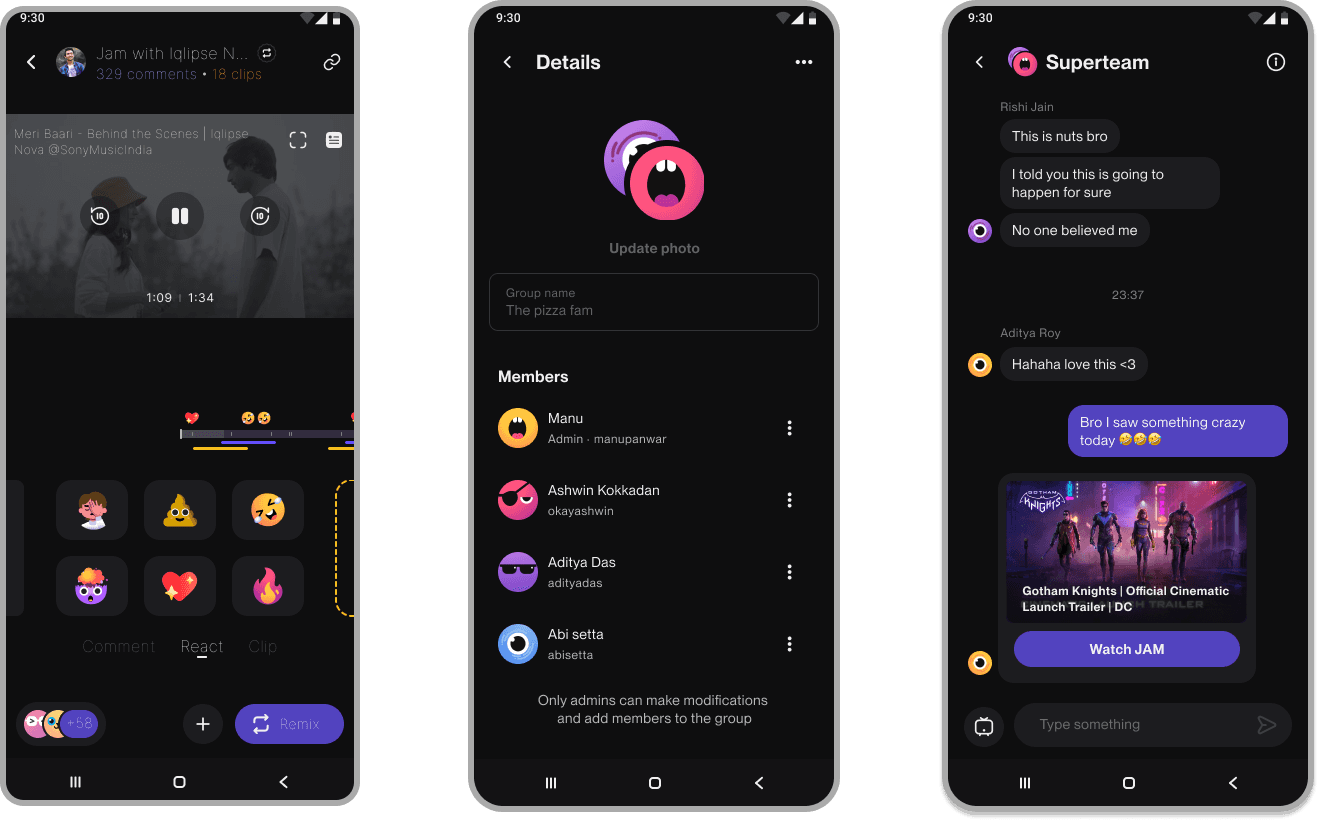
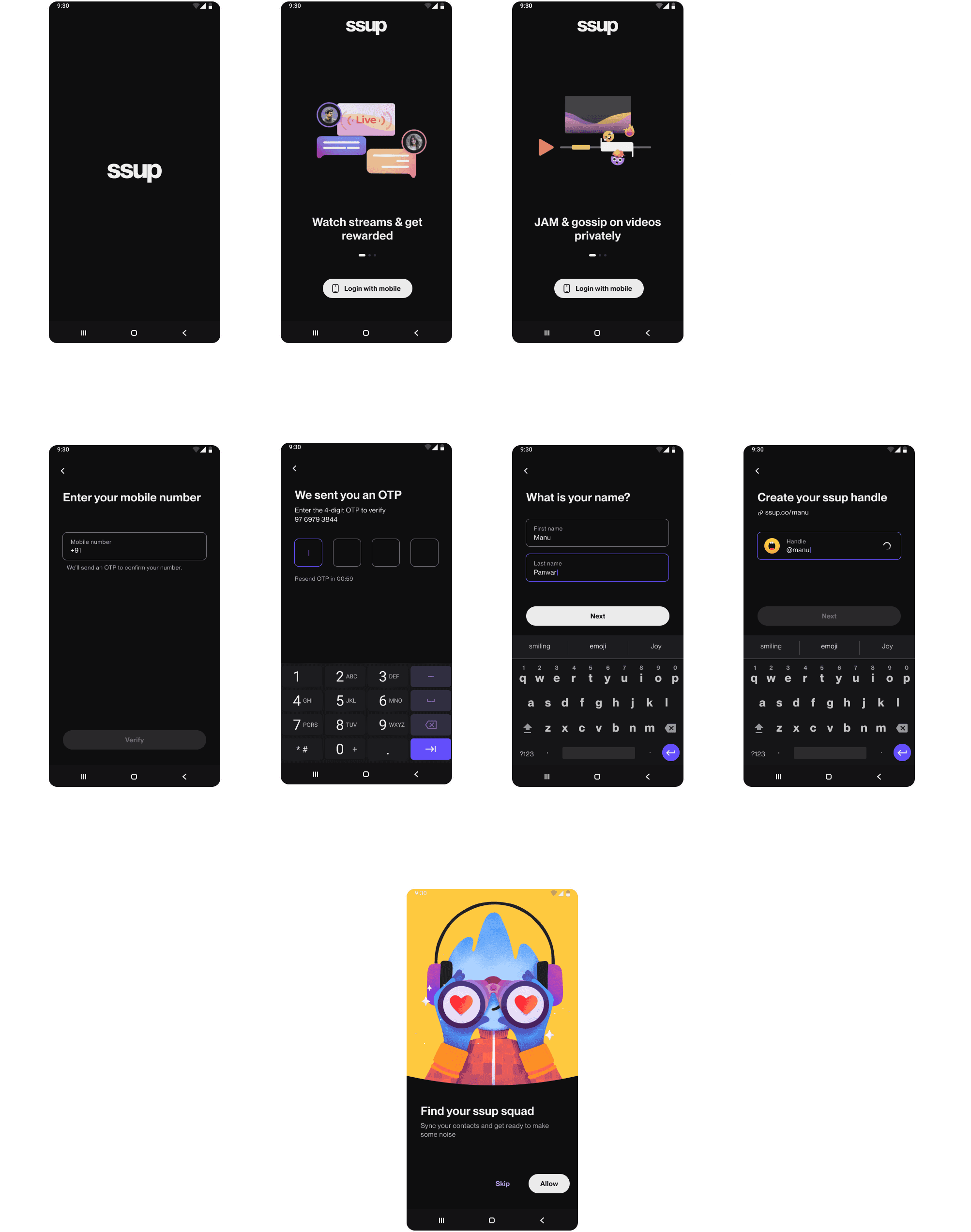
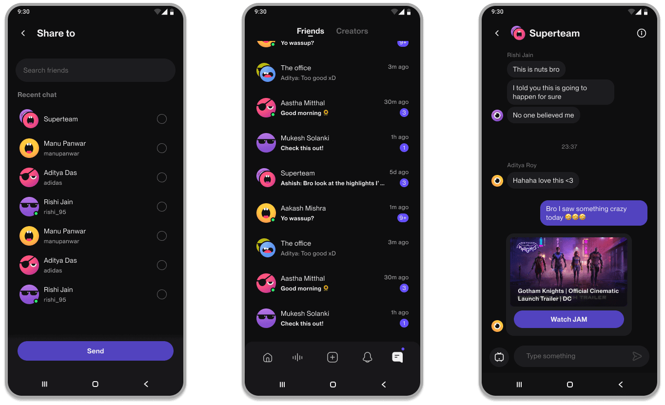
JAM App
The JAm app, a creation of Supershare, was designed to be a YouTube watch party platform with a social twist. It allowed users to watch videos simultaneously with friends or strangers, share their live reactions, and create remixes of the content. This innovative approach aimed to make online video consumption more engaging and interactive, bridging the gap between passive viewing and active participation.
Visual Design
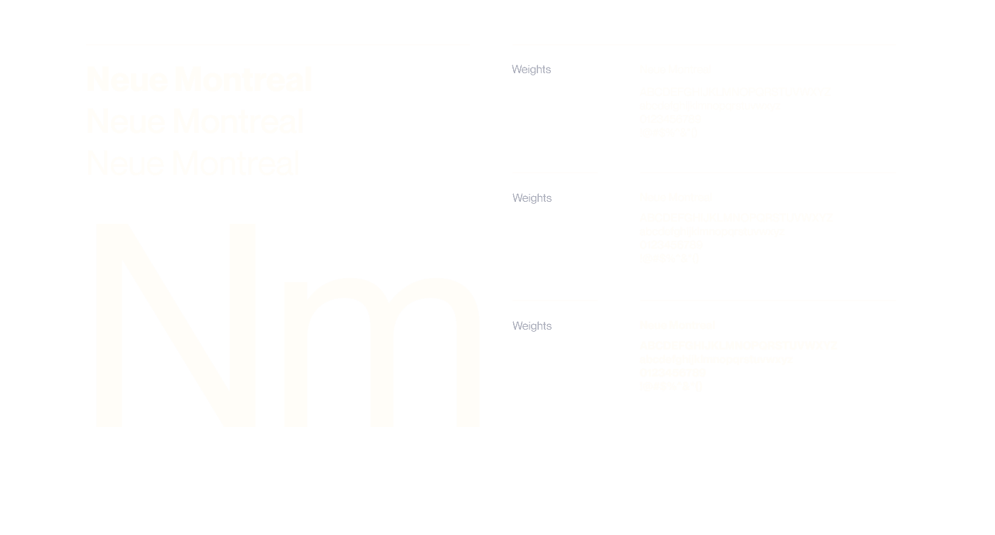
Font
Neue Montreal was chosen for its modern, sleek look, aligning perfectly with the app's innovative style. Its readability ensures easy engagement with the content, while adding sophistication to the overall design.
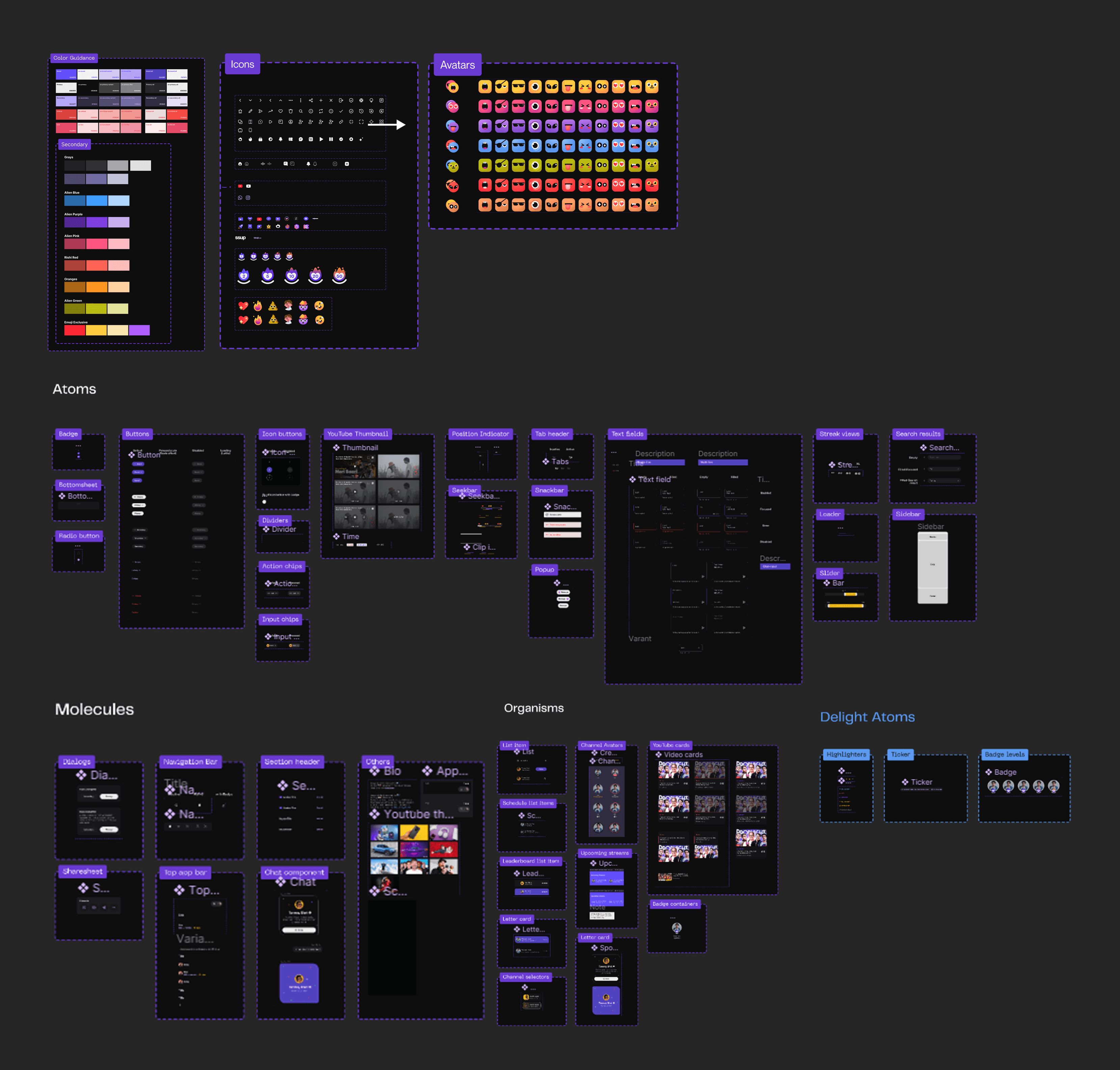
Visual Systems
Everything from the icons, buttons to color scheme.
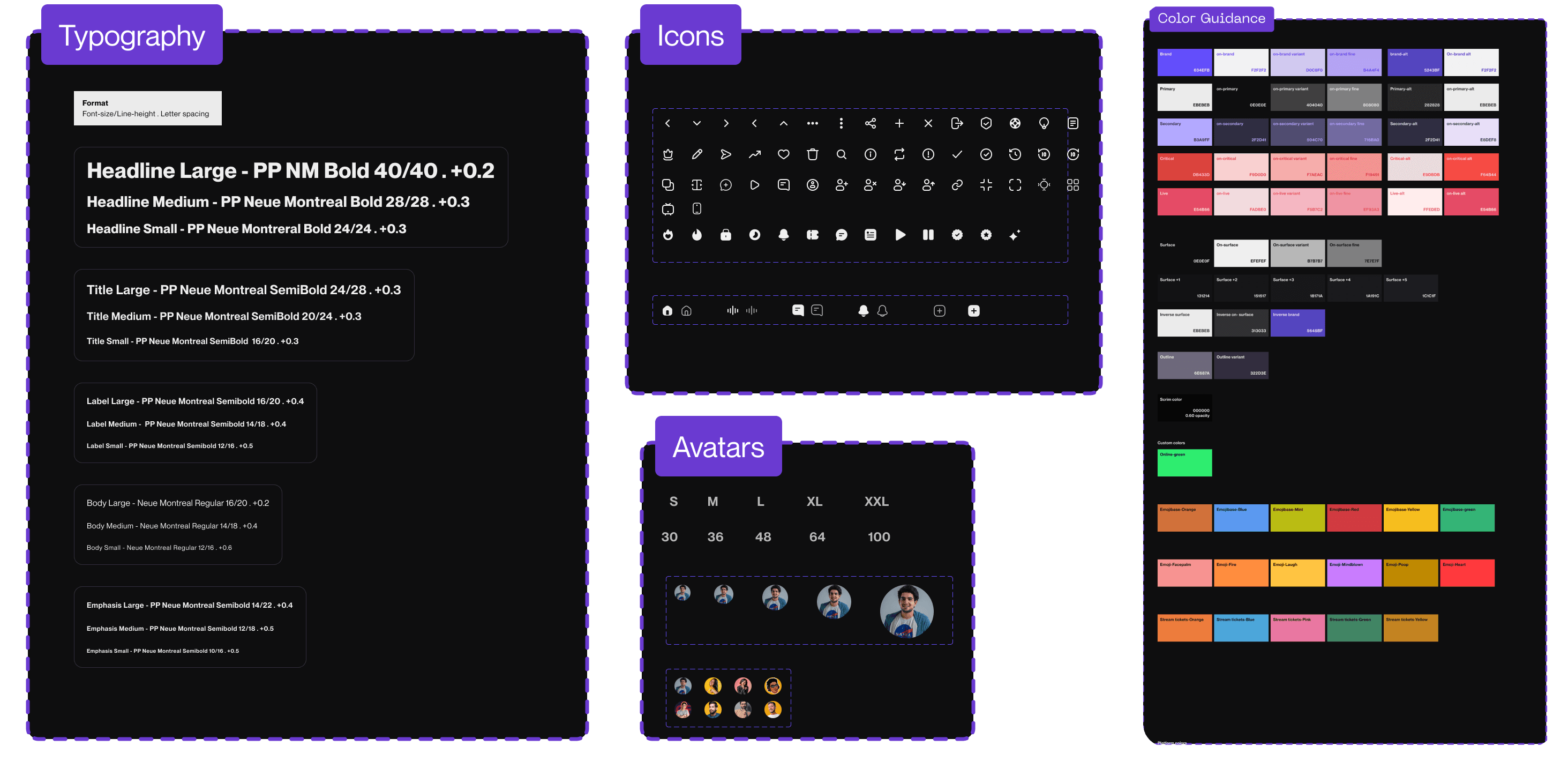
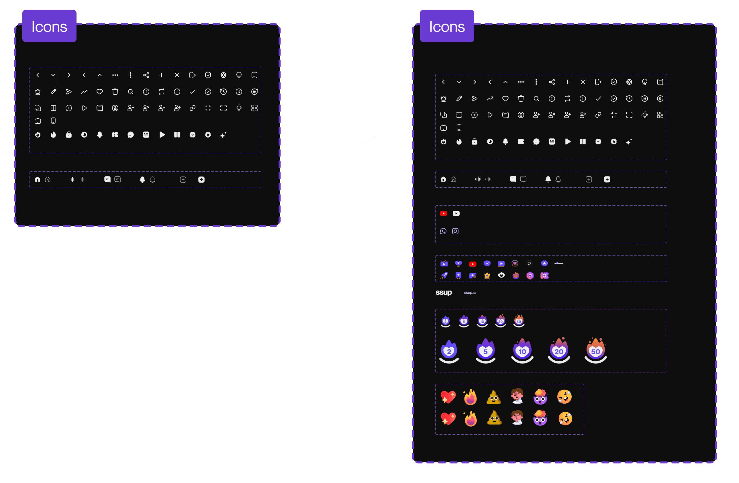
Icons
A custom set of emojis adds uniqueness, engagement, and expressiveness to the app, enhancing brand identity and user interaction.

Emojis and Avatars
Custom emojis and avatars further enhance the app's personality and user experience by adding uniqueness and personalization. They make interactions more engaging and expressive, fostering a stronger connection between users and the app.


Motion
I crafted custom animations and motion designs for the app, including for empty state screens and onboarding. These add dynamism and engagement, guiding users through the app seamlessly while enhancing the overall user experience.


Button Interactions
Follow
?
favorite


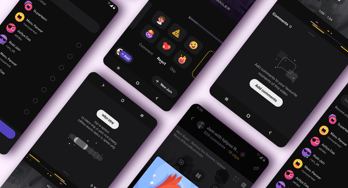
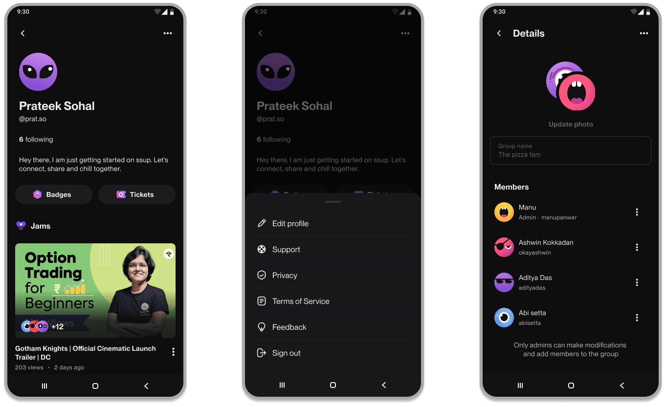
Screens
Onboarding
Home

Chat
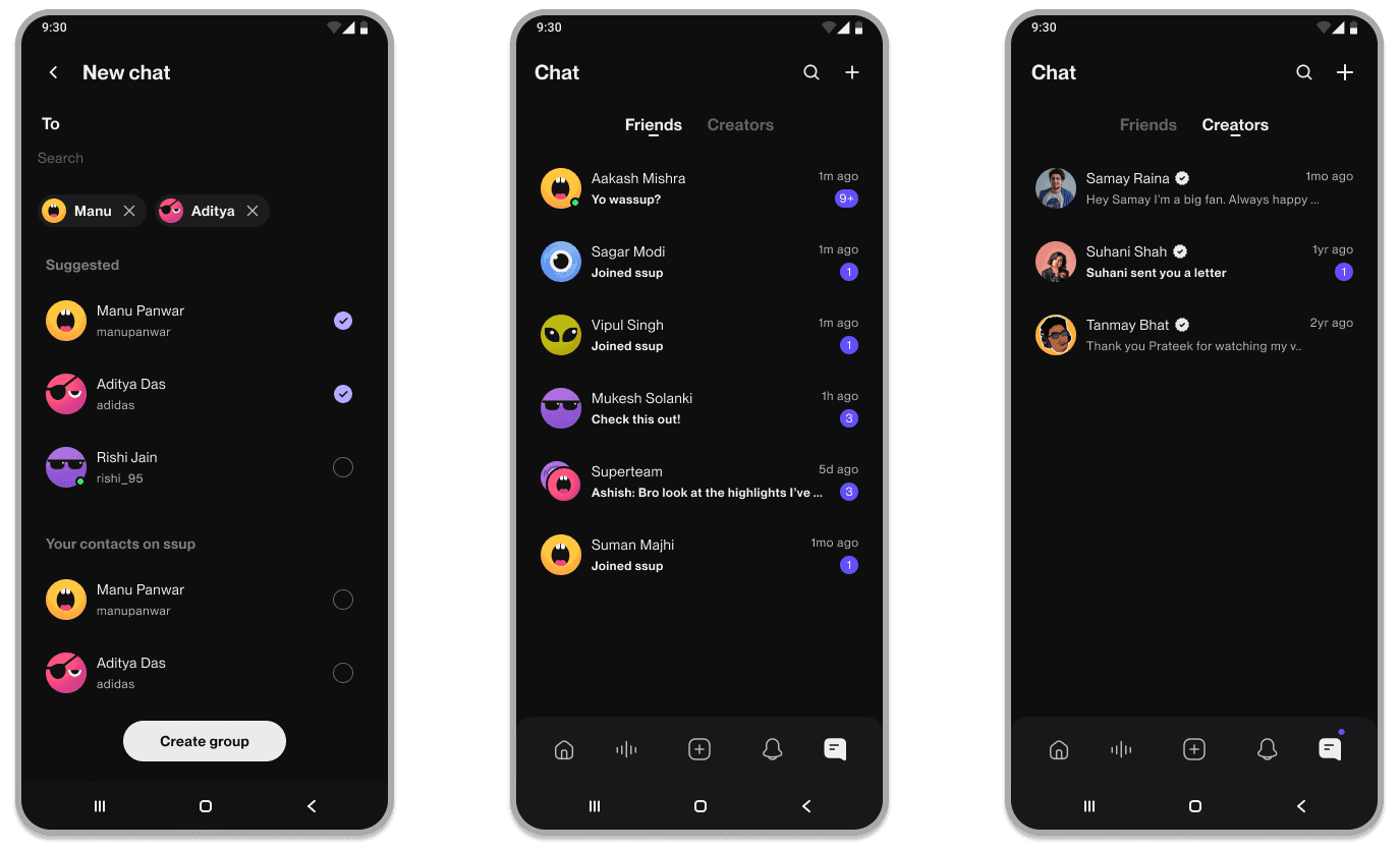
Profile
Empty States

Research
Scope
User Study
App Screen Intergration
Testing and Iteration
User Study
Who are We Targetting?
In Internet culture, the 1% rule is a general rule of thumb pertaining to participation in an Internet community, stating that only 1% of the users of a website actively create new content, while the other 99% of the participants only lurk.
The latter 99% can be expanded into active participants (sharers) and passive lurkers. Since the entire app is built on the act of sharing content, this will be our primary target audience.

Why Sharers?
The people who created video reactions in our app, had a sharing K-factor of 1:6 which is to say that the users who created a reaction got at least 6 people to view their reactions on our web app.
There was an opportunity to target an untapped TG of people who had a truly altruistic reason to share content to their friends and other network. Sharers are in a sense curators of great content personalised for their friend or group they are sharing it in. We wanted to reward them and eventually build a community of best content sharers out there.
We applied the Sixth degree network law with the above premises, and formulated the hypothesis that ”Targeting sharers can solve for our distribution challenge and build a community of great content curators in the long run.”
Conduct a thorough evaluation of Supershare's existing design elements, including color schemes, typography, iconography, and overall visual style. Identify strengths, weaknesses, and areas for improvement.
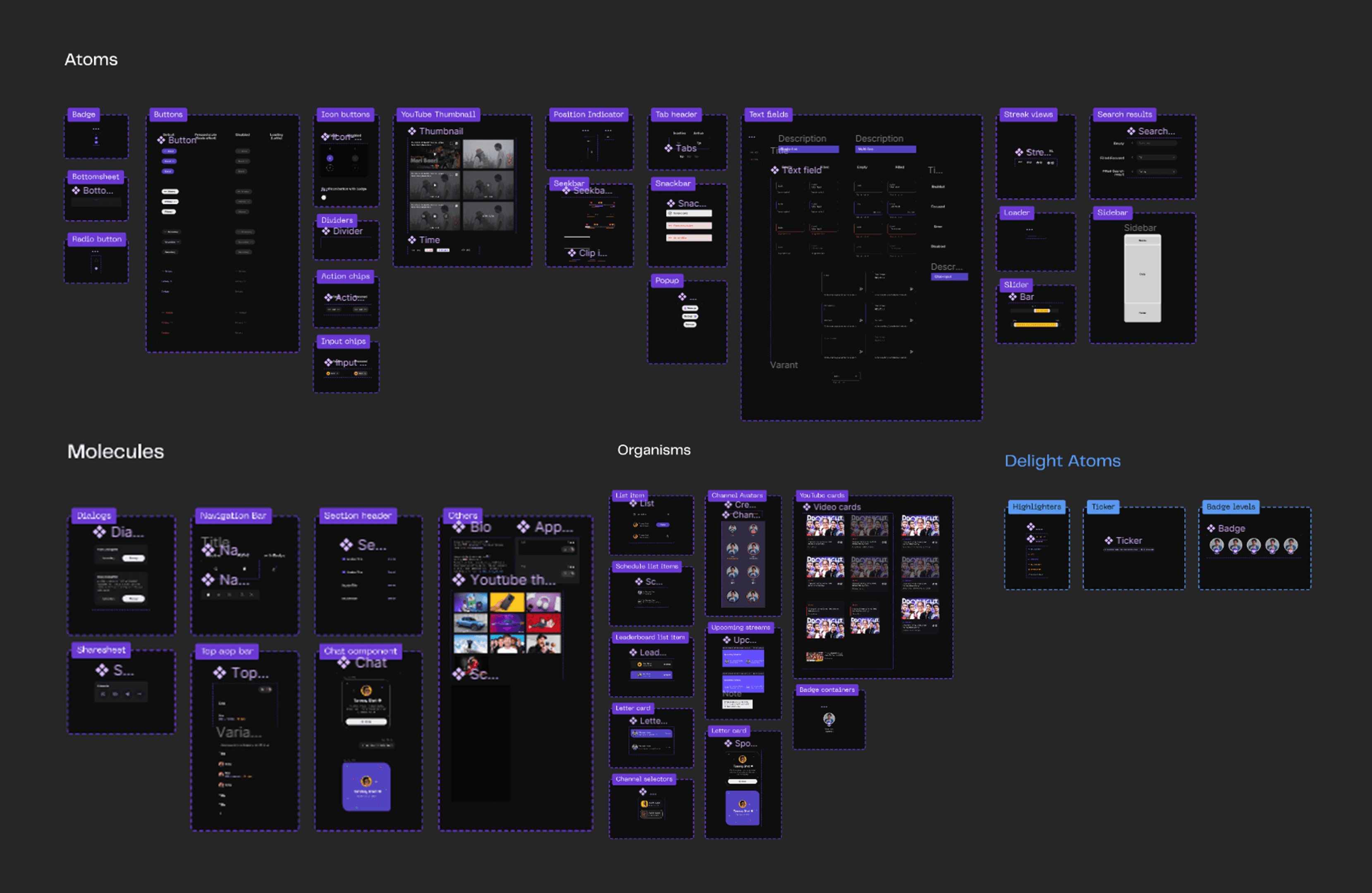
Design Systems
Areas of Improvement
Cohesive Color Library:
Rebuild the color library to ensure consistency and coherence across all assets.
Establish a set of primary and secondary colors to be used consistently throughout avatars, icons, and other visual elements.
Avatar Redesign:
Current avatars are stock images, lacking uniqueness and personalization.
Develop a new set of avatars to replace stock images, reflecting the brand identity and diversity.
Icon Library Development:
Current icons are licensed, posing potential limitations and costs in the long run.
Create a proprietary icon library tailored to the brand's needs and aesthetic.
Long-Term Benefits:
Greater control and ownership over visual assets, reducing dependency on third-party resources and licensing fees.
Enhance brand identity and recognition through consistent and customized visual elements.
Development of Visual System
Conduct a thorough evaluation of Supershare's existing design elements, including color schemes, typography, iconography, and overall visual style. Identify strengths, weaknesses, and areas for improvement.
The Delight Factor
The delight factor in design refers to the element of surprise or joy that users experience when interacting with a product or interface. It involves incorporating unexpected, delightful moments or features that exceed users' expectations and evoke positive emotions, enhancing their overall experience. This could include animations, playful interactions, personalized touches, or thoughtful details that make the user's interaction memorable and enjoyable.

Expectation
Delight
Emojis
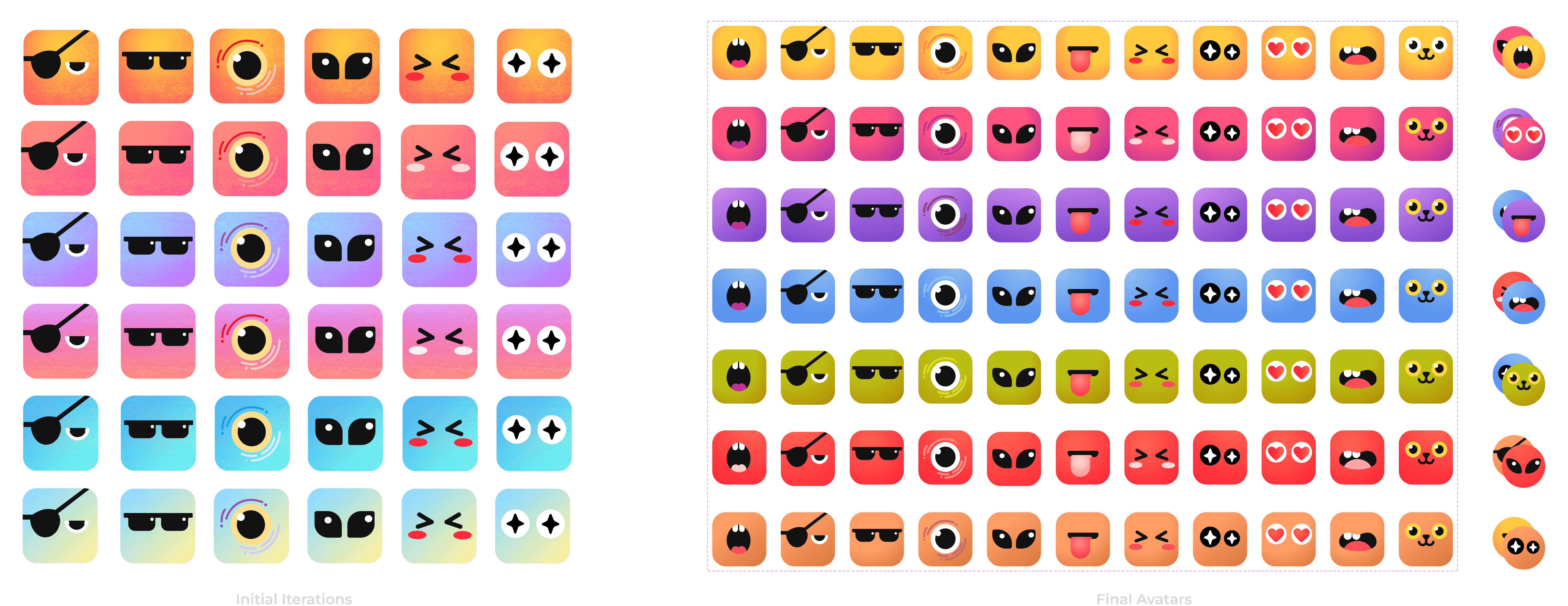
An Experiment
While redesigning the app assets, we decided to experiment with custom emojis to replace the stock emojis. We wanted something more fun and energetic to better suit the app's vibe. This experiment aimed to push the design boundaries and gauge feedback from our testers.
Expanding on the Delight Factor and testing its limits.

After implementing the new emojis into the app the tester came back with a few key concerns,
Discernibility: Consider refining the design to make the emojis more recognizable as emojis rather than stickers.
Color Scheme: Reevaluate the color scheme, especially the purple base color, it gave a more negative vibe to the users.
Clickability: Ensure that the pressability of the emojis is clear to users.
Consistency: Maintain some level of consistency with stock emojis to facilitate easy identification.

Avatars
Incorporating insights gleaned from asset creation and our updated color scheme, we crafted user avatars. Each avatar is based on the various characters used in the companies branding and marketing.
Expansion of Design Systems
Drawing from the iterative improvements we've made thus far, we've overhauled our design systems and streamlined the organization of our Figma files. By incorporating these changes, implementing updates becomes faster and more efficient.
We've established a user-friendly library within Figma, making it easy for team members to access and utilize the latest assets, colors, and design elements. This revamp not only enhances workflow efficiency but also ensures consistency and coherence across all design iterations.